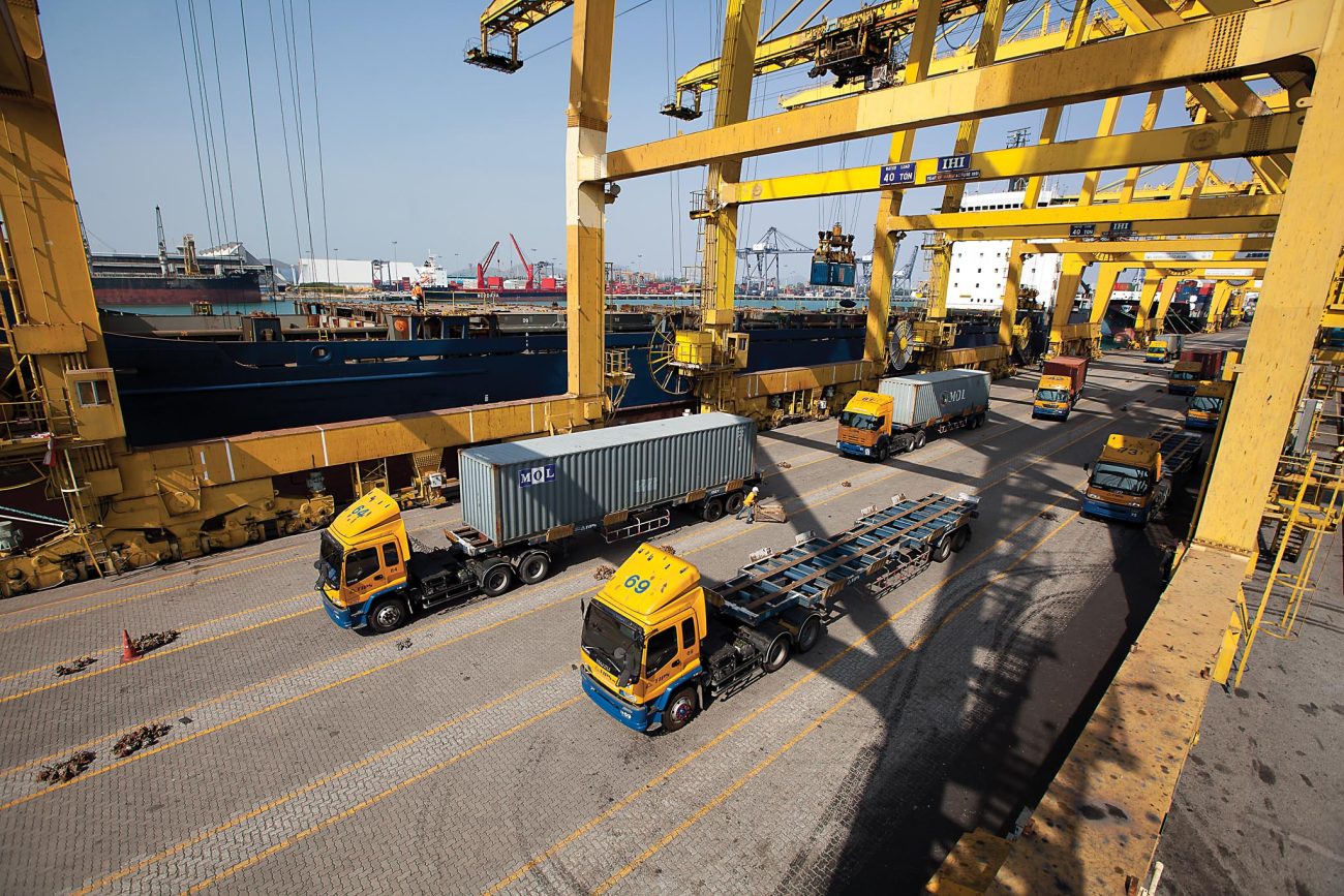
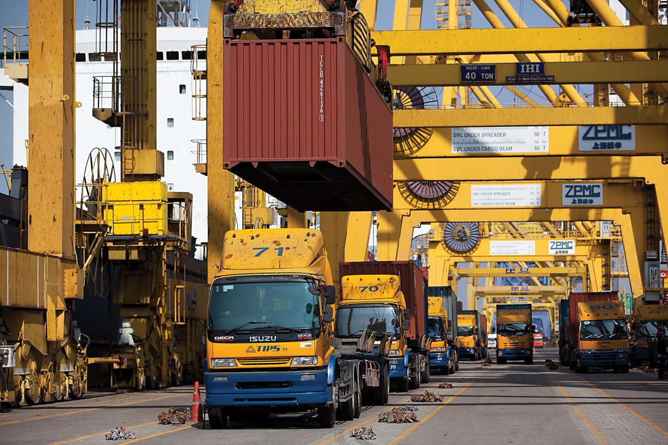
TIPS is one of the most successful container terminal operators at Laem Chabang Port, currently operating under a 30-year concession granted by the Port Authority of Thailand. It is a consortium of three ocean carriers; MOL and NYK from Japan and Ngow Hock (RCL) from Thailand.
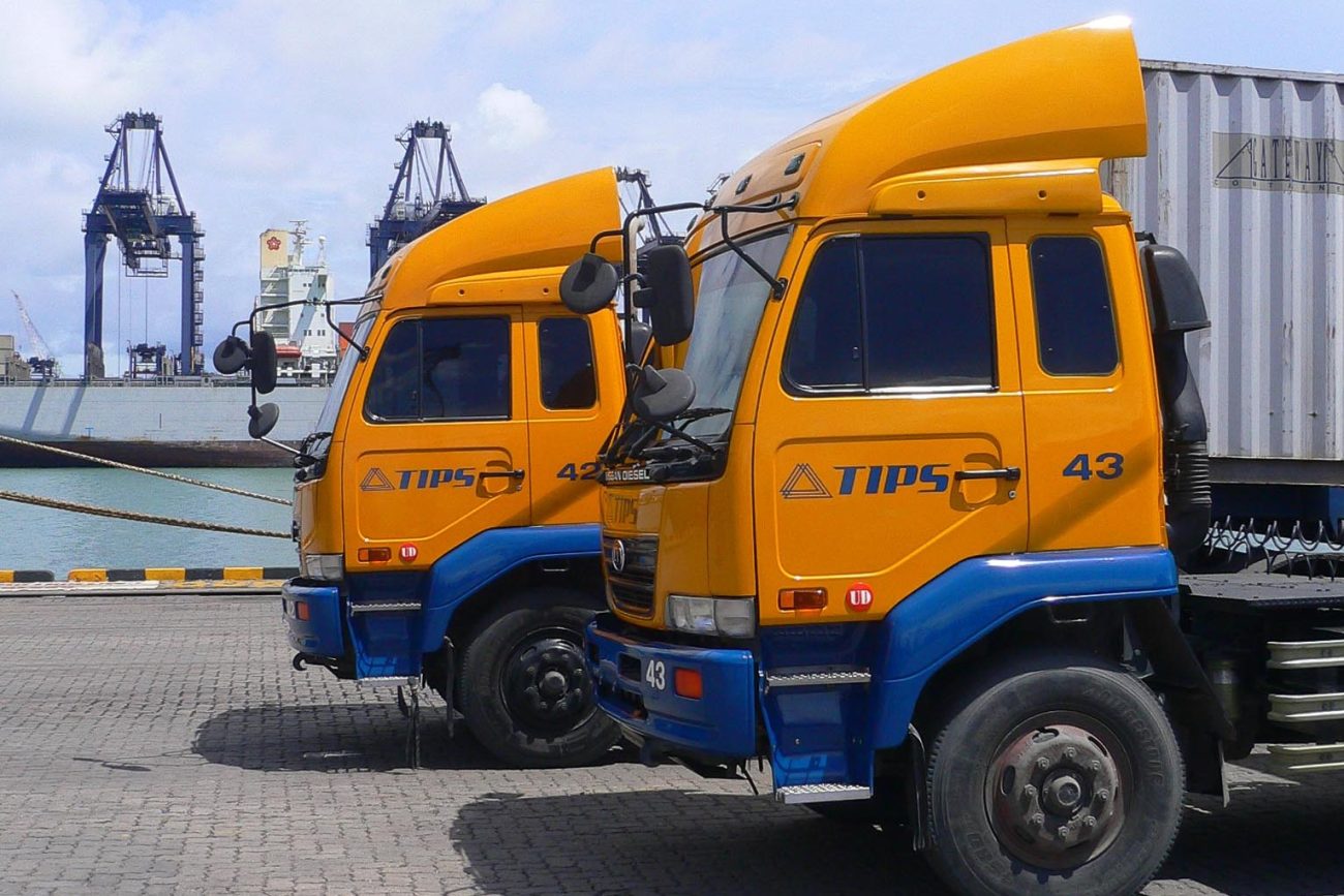
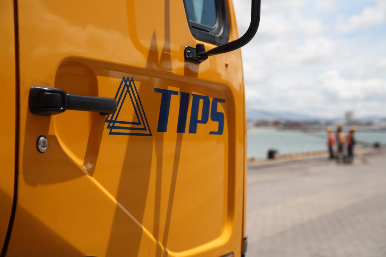
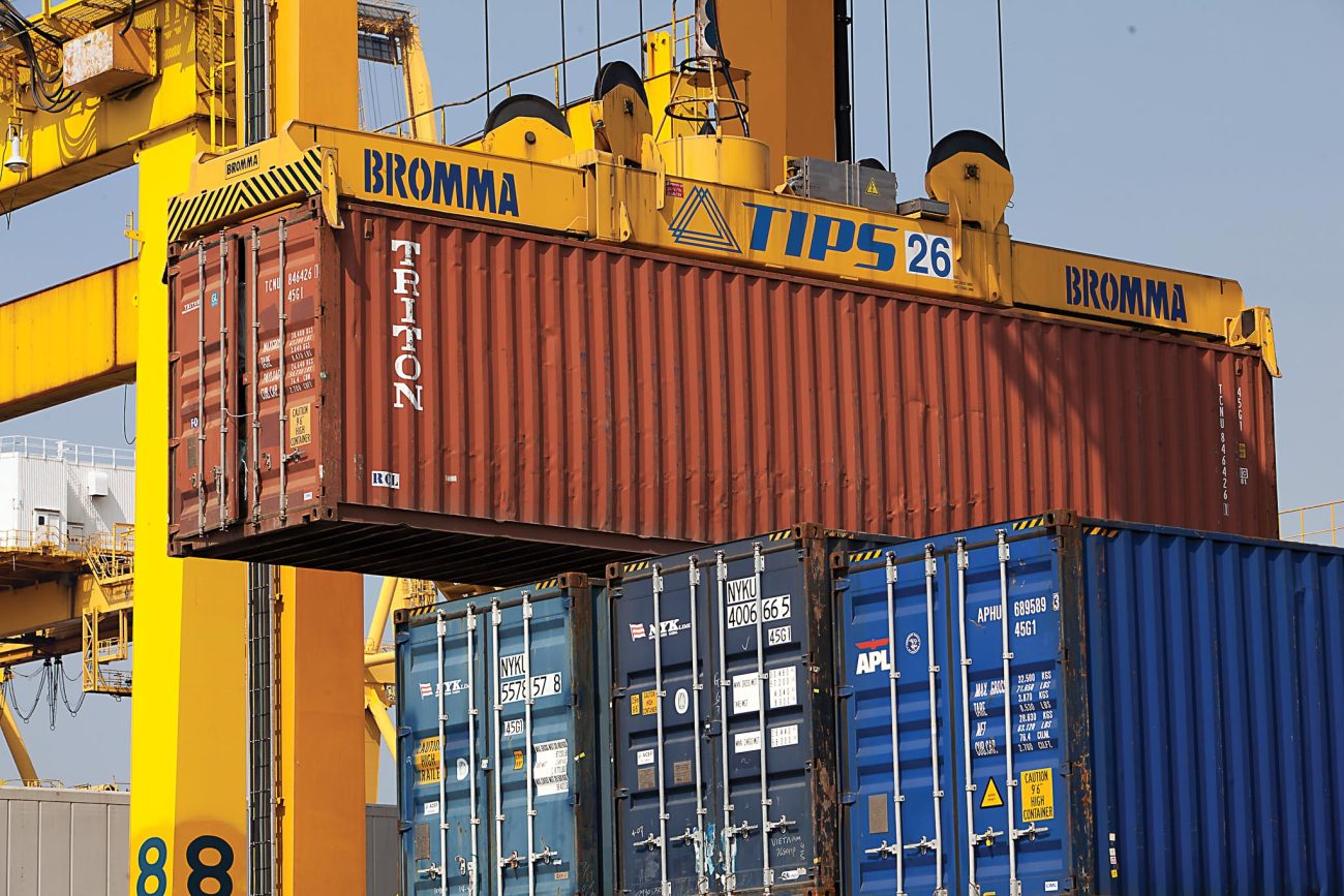
As part of TIPS corporate rebranding, the company commissioned Lentus to revitalise its logo without disregarding the essence and history of its design. The outcome utilises a sleek and modern typeface that still maintains the character of the old logo and combines it with an abstract representation of the brand’s three founding ocean carriers.
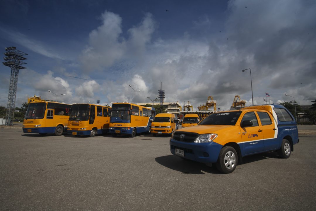
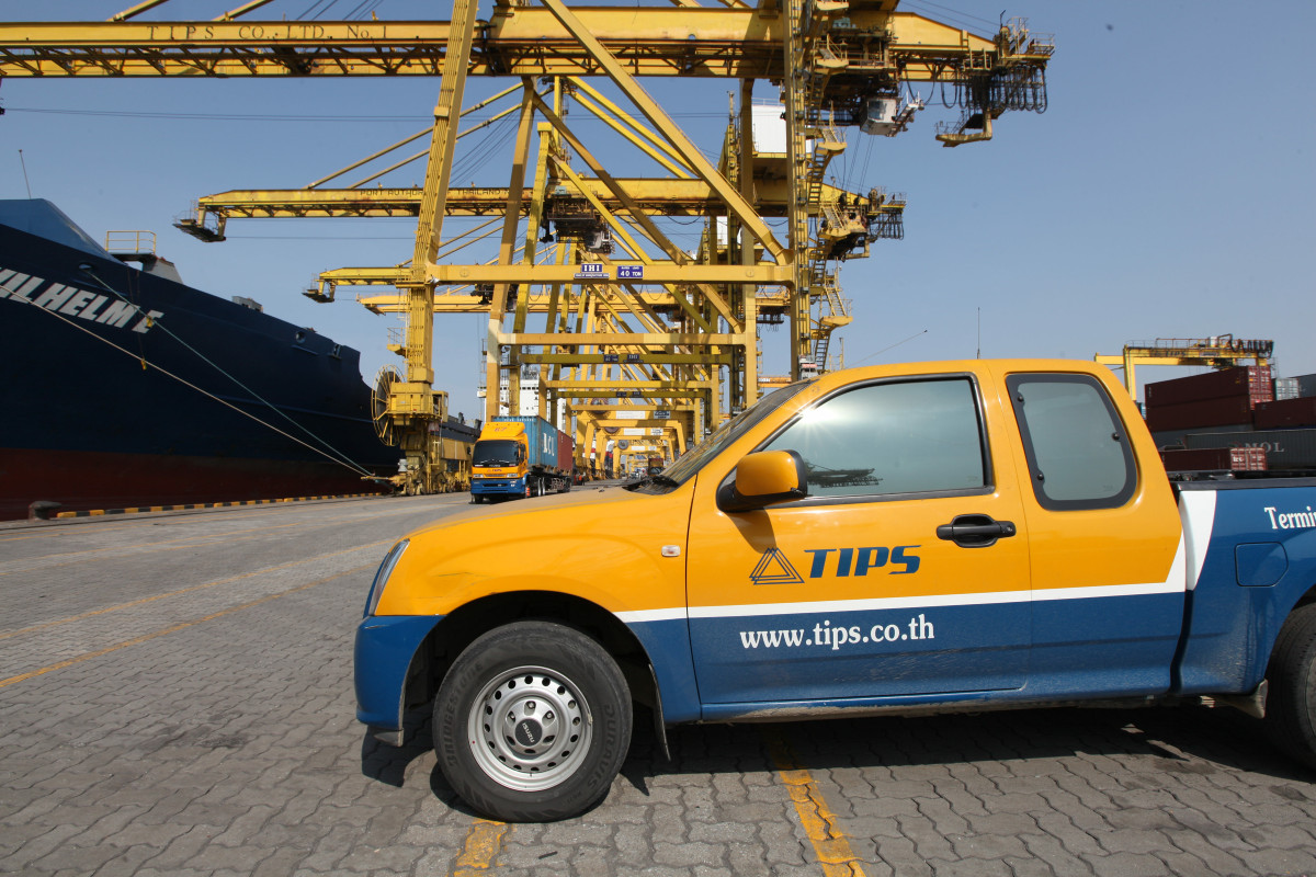
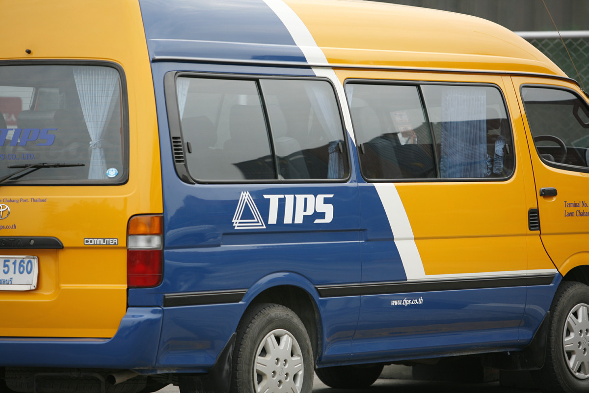
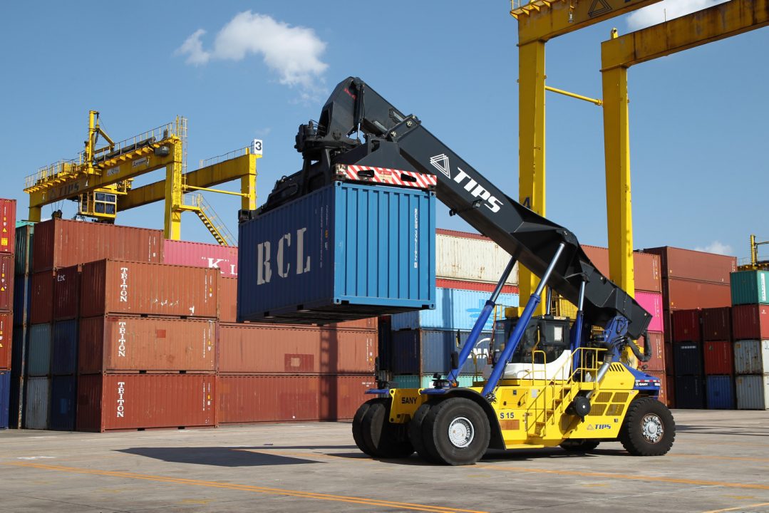
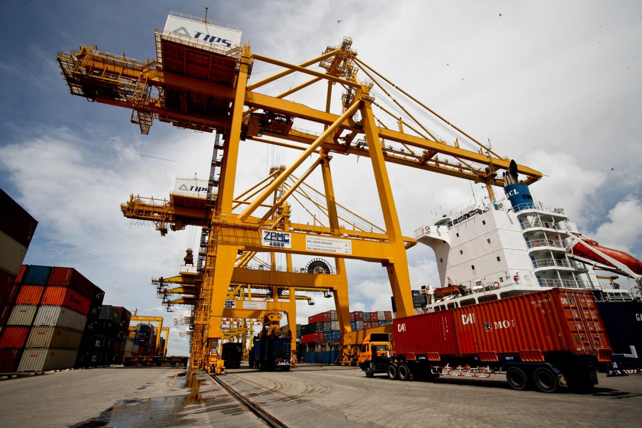
TIPS also asked us to freshen up its overall brand identity by standardising its colour scheme, coinciding with an all-new livery design for its vehicles and port equipment. Ultimately, we agreed upon a combination of deep blue and warm yellow with a white trim, which provides a professional and safety-conscious aesthetic for the terminal operators entire fleet.